During my career as a Software Engineer/Report Architect I have defined several rules for designing automated reports. I always follow these rules and get positive feedback from the report users. I hope these rules will help you too.
Rule 1: Actionable Report
A report should be actionable. That means that after reviewing the report a report user should be able to make decisions to correct an identified business problem. Also the report is considered actionable if it helps to identify areas for further investigation.
Review the report example below that supports a real-estate renting business. The report calculates count of every weekday per year. Potentially years with most weekends would bring bigger rent profit for the business.
Year  Su Mo Tu We Th Fr Sa Days   Year  Su Mo Tu We Th Fr Sa Days
1999: 52 52 52 52 52 53 52 365    2015: 52 52 52 52 53 52 52 365
2000: 53 52 52 52 52 52 53 366    2016: 52 52 52 52 52 53 53 366
2001: 52 53 52 52 52 52 52 365    2017: 53 52 52 52 52 52 52 365
2002: 52 52 53 52 52 52 52 365    2018: 52 53 52 52 52 52 52 365
2003: 52 52 52 53 52 52 52 365    2019: 52 52 53 52 52 52 52 365
2004: 52 52 52 52 53 53 52 366    2020: 52 52 52 53 53 52 52 366
2005: 52 52 52 52 52 52 53 365    2021: 52 52 52 52 52 53 52 365
2006: 53 52 52 52 52 52 52 365    2022: 52 52 52 52 52 52 53 365
2007: 52 53 52 52 52 52 52 365    2023: 53 52 52 52 52 52 52 365
2008: 52 52 53 53 52 52 52 366    2024: 52 53 53 52 52 52 52 366
2009: 52 52 52 52 53 52 52 365    2025: 52 52 52 53 52 52 52 365
2010: 52 52 52 52 52 53 52 365    2026: 52 52 52 52 53 52 52 365
2011: 52 52 52 52 52 52 53 365    2027: 52 52 52 52 52 53 52 365
2012: 53 53 52 52 52 52 52 366    2028: 53 52 52 52 52 52 53 366
2013: 52 52 53 52 52 52 52 365    2029: 52 53 52 52 52 52 52 365
2014: 52 52 52 53 52 52 52 365    2030: 52 52 53 52 52 52 52 365
The report shows that the years with maximum weekend days are very rare – they are at least 28 years apart: see the years 2000 and 2028. That means the potential profit difference is insignificant (less than 0.5%). What actions or decisions can we make based on the data from this report? Have we identified a problem for further investigation? No! This report is nice since it shows information not known before, but it is completely useless for any real business. Sometimes the reporting requirements only appear to be solid. Identify and retire useless reports.
Summary: Design each report to support actions and decisions. Avoid showing “nice-to-know” but useless data.
Rule 2: One Objective for One Report
Design every report with only one objective to reflect aspects of only one major business area. A very complex business area may be covered by several reports linked to each other: the main report shows summary of the business area and a few sub-reports present various aspects of that area.
Enhancing an existing report to support unrelated reporting objectives may decrease the report ability to serve its main objective. As report users get familiar with their reporting solution they start requesting new features and enhancements to the existing reports. Most of these feature requests hide new reporting objectives. Carefully analyze all incoming requests from customers and try to identify new business areas which deserve their own report.
The report “Warehouse Status” shown below is an example of fitting too many objectives into one report. This report presents a list of products with related information: price, return policy and next arrival details.

The report shows useful information in clear format, but different customers will have problems with using this report as the report design has an issue. The report tries to cover use-cases of three different departments responsible for product inventory, order processing and shipment logistics. Since the report space is used to fit unrelated data there is simply no space left to provide all important details to make the report actionable in any of these areas. For example, employees responsible for logistics don’t need return policy data, but they need more details about next arrival. We should split this report into three different reports based on the requirements from three different departments.
Summary: Design each report to describe only one business area.
Rule 3: Report Readability
A well designed report should be easy to analyze on a computer screen or paper when printed. Simple techniques such as graying every second record in a table, rendering table headers on every page, aligning numbers to the right, providing legend to every chart/graph and many more – all these techniques improve the report readability. Not all techniques should be implemented in every report, but all of them should be considered during the report design phase.
The best advice is to learn all those techniques. Read a few books for designing web-pages and printed materials. Most topics described in the design books apply to the reporting industry as well. You will learn which font suites best for titles, headers, descriptions; how to choose colors to highlight report elements; the same color could mean completely different concepts in different cultures.
Organize a usability study to prove that reports are easy to read and understand. If your budget is tight show the reports to your colleagues, customers or friends and think about their feedback. Remember about accessibility. People with eye sight disorders, such as color-blinding, may struggle with badly designed reports.
Summary: Know your report customers. Learn the design techniques.
Rule 4: Amount of Data
A report should contain certain amount of data to be actionable. Too much data hurts readability while lack of data makes the report less actionable. It is difficult to define the “ideal amount” of data, so the example below helps to describe this rule.
Consider a report that shows information about products stored in a warehouse. The report shows all the products with their 20-30 properties and description. Information about one product fits in half of a printed page and provides all the needed data to warehouse administrators about a particular product. The problem with this report is that it shows a long list of products that, if printed, may spread across hundreds or thousands of pages. This report is not possible to use without computerized search/filter functionality or without “table of contents” if printed. This example describes the product catalog, not the actionable report. Don’t be confused by used technology, the same technology can be used to implement catalog systems and reporting solutions.
If your reporting solution contains this type of reports don’t throw them away, add filtering parameters, table of content or interactive navigation. Add new actionable reports to the related business areas.
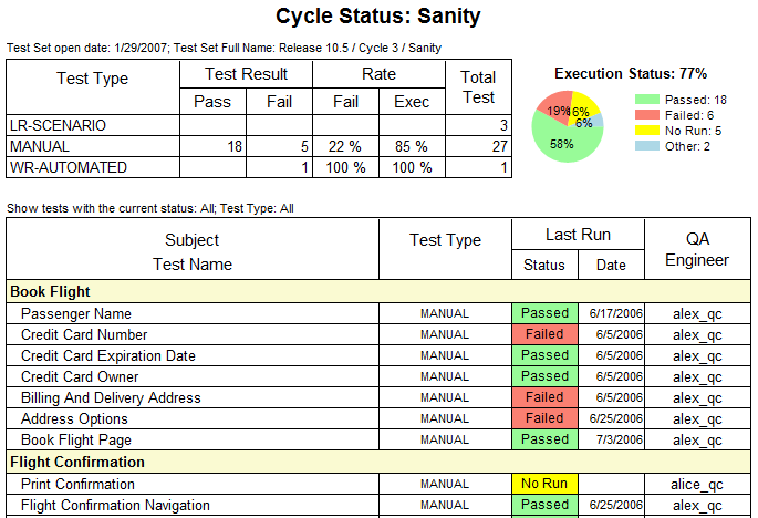
If your report contains details that are shown on multiple pages consider adding short summary to the first page of the report. See the example below:
Summary: Avoid very long reports.
Thanks for reading this article. Now try to design your ideal report!
Feel free to share your rules in the comments below.